Психология цвета на веб-сайтах, предлагающих домашние услуги: Повышайте конверсию и привлекайте клиентов
Color is ubiquitous, from the vibrant leaves of different seasons to the hues of a sunset sky and even the shade of coffee when cream is added. Websites are no exception.
At the stage where the foundation of the layout is laid and fonts are chosen, it’s time to add color. Color is unique in its ability to evoke emotions and convey trust and values to customers.
Важность цвета в дизайне сайтов
Color is a crucial component of website design. It helps to convey feelings and emotions to the audience that text or images alone may not. Color reflects brand values and highlights critical elements like calls to action. Utilizing color effectively can help a home services website succeed.
Основы цвета
Понимание основ цвета является ключевым. Вот основные термины, с которыми вы можете столкнуться:
Основные цвета
Это база для всех остальных цветов и традиционно включают красный, синий и желтый. В последние годы также признаны магента, циан и желтый.
RGB и HEX
Система RGB (красный, зеленый, синий) используется для экранных дизайнов. Например, белый - это rgb(255, 255, 255), а черный - rgb(0, 0, 0). HEX-коды, такие как #ffffff для белого и #000000 для черного, представляют собой шестизначные комбинации, используемые в веб-дизайне.
Оттенки и тени
Оттенок создается путем добавления белого к цвету, а тень - путем добавления черного. Эти вариации могут помочь достичь разных визуальных эффектов на веб-сайте.
Насыщенность
Это характеристика, описывающая интенсивность цвета. Повышенная насыщенность делает цвет более насыщенным, а пониженная - более светлым.
Оттенок
Этот термин описывает, насколько цвет похож или отличается от цветов радуги (красного, оранжевого, желтого, зеленого, синего, индиго, фиолетового). Он помогает различать один цвет от другого.
Цветовые схемы
При разработке веб-сайта рассмотрите следующие общие цветовые схемы:
Монохромная
Основана на одном цветовом тоне, используя оттенки одного оттенка. Создает целостный и гармоничный вид.
Дополнительная
Включает два противоположных цвета на цветовом круге, обеспечивая естественный контраст. Это идеально для призывов к действию.
Аналоговая
Использует один базовый цвет и два соседних вторичных цвета для выделения и акцентов. Обеспечивает приятный и спокойный дизайн.
Триадическая
Состоит из трех равномерно расположенных цветов на цветовом круге, создавая яркую схему. Эта схема добавляет энергию и живость на веб-сайт.
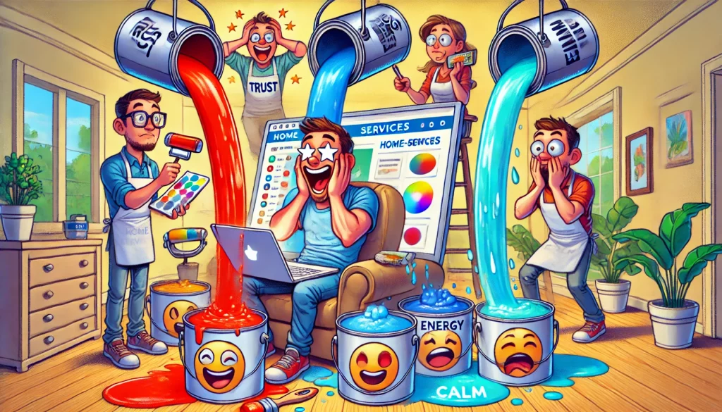
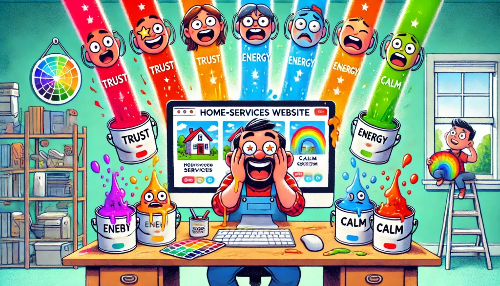
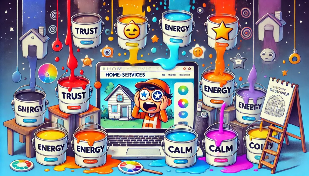
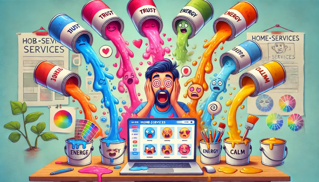
Влияние цветовой психологии на веб-сайт
Цветовая психология помогает понять, как цвета могут влиять на восприятие и действия клиентов. Важно помнить, что значение цветов может быть субъективным и варьироваться в разных культурах.
Red
Conveys strength, passion, and alertness. Ideal for call-to-action buttons. Studies show that red can increase metabolism and create a sense of urgency, which is beneficial for limited-time offers (source: Color Psychology).
Applications: Red is frequently used in e-commerce websites to draw attention to sale items or limited-time deals. Its ability to create a sense of urgency makes it effective for “Buy Now” or “Limited Time Offer” buttons.
Psychological Impact: Red’s high visibility can enhance recall and reaction speed, making it useful in situations where immediate action is desired.
Cultural Considerations: While red is generally positive in Western cultures, symbolizing love and excitement, it can have different connotations elsewhere. For example, in some Eastern cultures, red symbolizes luck and prosperity, whereas in certain contexts, it might signify warning or danger.
Orange
Represents security, warmth, and fun. Suitable for industries like construction. Research indicates that orange can stimulate physical activity, competition, and confidence (source: Psychology of Color).
Applications: Orange is often used by brands aiming to project a friendly and approachable image. It works well in banners, call-to-action buttons, and promotional materials.
Psychological Impact: Orange is energetic and can evoke feelings of enthusiasm and excitement. It’s particularly effective in contexts that involve competition or physical activity.
Cultural Considerations: In Western cultures, orange is associated with autumn and harvest. In some Asian cultures, it is linked to spirituality and meditation.
Yellow
Evokes warmth and sunshine. Best used sparingly due to its intensity. It is known to grab attention quickly and is often used in warning signs (source: Color Matters).
Applications: Yellow is effective in highlighting important information or elements that need to stand out. It is often used in banners, alerts, and buttons that require immediate attention.
Psychological Impact: Yellow can create a sense of happiness and cheerfulness, but if overused, it can lead to feelings of anxiety or agitation.
Cultural Considerations: Yellow is often associated with joy and energy in Western cultures. However, in some cultures, it can be linked to caution or cowardice.
Green
Symbolizes health and growth. Great for environmentally-friendly businesses. Green has a calming effect and is often associated with tranquility and health (source: Verywell Mind).
Applications: Green is commonly used by businesses related to health, wellness, and environmental sustainability. It’s ideal for backgrounds, logos, and buttons that want to evoke a sense of peace and safety.
Psychological Impact: Green is calming and can reduce stress. It is associated with balance and harmony, making it suitable for settings that aim to be soothing.
Cultural Considerations: Green symbolizes growth and renewal in many cultures. In Islamic culture, it holds a significant religious value, while in Western cultures, it is associated with nature and environmentalism.
Blue
Denotes trust and efficiency. Suitable for services like window cleaning. Blue is shown to boost productivity and is the most preferred color globally (source: Color Psychology).
Applications: Blue is widely used in corporate and professional settings, such as finance, technology, and healthcare. It is suitable for websites that need to convey reliability and professionalism.
Psychological Impact: Blue can have a calming effect and is often linked to feelings of security and trust. It can also enhance productivity, making it a popular choice in office environments.
Cultural Considerations: Blue is a universally liked color, but its meanings can vary. In some cultures, it is associated with mourning, while in others, it symbolizes trust and dependability.
Purple
Implies luxury and quality. Good for highlighting premium services. Purple has been associated with royalty, luxury, and sophistication for centuries (source: Psychology Today).
Applications: Purple is often used by brands that want to convey a sense of luxury and exclusivity. It is suitable for high-end products, cosmetics, and premium services.
Psychological Impact: Purple can evoke feelings of mystery and imagination. It is often linked to creativity and wisdom.
Cultural Considerations: Purple is associated with royalty and wealth in many cultures. In some Western cultures, it is also linked to spirituality and meditation.
White
Signifies purity and simplicity. Effective for backgrounds and cleanliness-focused services. White space is essential in website design for improving readability and user experience (source: Smashing Magazine).
Applications: White is used to create a sense of space and clarity. It is ideal for backgrounds, especially on websites that focus on cleanliness and minimalism.
Psychological Impact: White can evoke feelings of purity, cleanliness, and simplicity. It helps in creating a neutral and balanced environment.
Cultural Considerations: In many cultures, white is associated with purity and peace. However, in some cultures, it is linked to mourning and funerals.
Black
Represents sophistication and substance. Useful for text and overlay backgrounds. Black is a powerful color that can convey elegance and formality (source: 99designs).
Applications: Black is often used in high-end branding and luxury products. It is effective for text, borders, and backgrounds that aim to convey sophistication.
Psychological Impact: Black can evoke feelings of power and elegance. It can also create a sense of mystery and formality.
Cultural Considerations: Black is associated with elegance and sophistication in Western cultures. However, it can also symbolize mourning and sadness in various cultures.
Полезные цветовые инструменты для начала работы
Если в брендовых руководствах указаны определенные цвета, их следует использовать для поддержания последовательности. Начиная с основного цвета из логотипа, такие цветовые инструменты, как Adobe Color, Palettable и Paletton, могут помочь найти дополнительные и аналогичные цвета.
Adobe Color
Adobe Color is a powerful tool for creating and experimenting with color schemes. It allows users to explore various combinations, ensuring that the chosen palette aligns with the desired aesthetic and functional requirements. Adobe Color offers features such as:
Color Wheel: Users can select base colors and explore analogous, monochromatic, triadic, complementary, and compound color schemes.
Color Harmony Rules: Ensures that chosen colors work well together, based on established principles of color harmony.
Extract from Images: Users can upload images and extract color themes directly from them, helping to maintain brand consistency.
Accessibility Tools: Includes options to check color contrast, ensuring designs are accessible to all users.
Интеграция: Seamlessly integrates with other Adobe Creative Cloud applications, allowing for smooth workflow transitions.
Palettable
Palettable is an intuitive and user-friendly tool designed for exploring and creating harmonious color combinations. It focuses on simplicity and ease of use, making it ideal for users who want to quickly find appealing color schemes without extensive technical knowledge. Key features include:
Interactive Interface: Users can swipe through different color options to find the perfect match for their needs.
Custom Palettes: Allows users to save and share custom palettes, facilitating collaboration and consistency in design projects.
Color Ratings: Users can rate colors, providing feedback and preferences which help in refining future color choices.
Minimalist Design: The clean and straightforward design of Palettable ensures a smooth and efficient user experience.
Paletton
Paletton is a comprehensive color scheme generator, offering advanced features for users with more complex color needs. It is particularly useful for designers who require precise control over their color choices. Some of its standout features include:
Advanced Color Wheels: Includes multiple color wheels and models, such as the traditional RYB color wheel and modern RGB color wheel, providing flexibility in design.
Color Adjustments: Users can fine-tune colors using various adjustments like brightness, saturation, and hue, ensuring exact matches.
Simulations: Paletton offers simulations to visualize how colors will appear under different lighting conditions and on various devices, ensuring consistency across platforms.
Palette Preview: Users can see how their chosen palette will look in different layouts and contexts, such as web designs, print materials, and more.
Export Options: Provides multiple export options, including CSS, PNG, and other formats, making it easy to integrate the palette into different projects.
Expert opinions on how colors impact customers
Сара Миллер, UX-дизайнер в BrightWave Studio:: “Color is a psychological tool that can guide user behavior on a home-services website. Our research shows that customers are 30% more likely to engage with a site using warm colors like yellow and orange in call-to-action buttons and contact forms.”
Джеймс Торнтон, стратег по маркетингу в HomePro Solutions:: “The choice of color significantly influences customer perception. Websites using blue tones see a 20% increase in customer retention because blue conveys trust and dependability.”
Лена Родригес, психолог и консультант по цветам:: “Color psychology plays a vital role in customer decision-making. Green symbolizes growth and safety, and using it effectively can lead to a 25% increase in customer inquiries.”

 10 мин